Analyzing the results of Wikipedia Banner Challenge
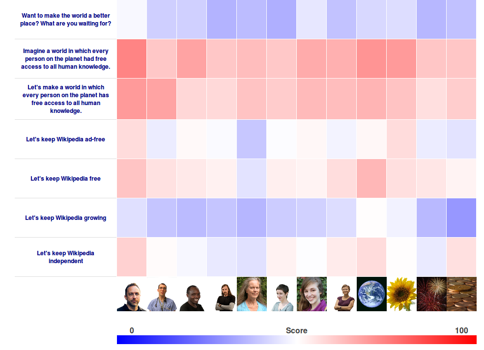
Monday, January 16, 2012Simple math and CSS are used to create the below heat map showing the results of the All Our Ideas Wikipedia Banner Challenge.

Pairwise data collection is particularly suited to matrix based visualization. We use intuitive colors so that after quickly skimming the results your gaze naturally drifts towards the better and worse banner pairs.